

The Tone Curve is Lightroom’s most precise contrast and color tool. Unlike the Contrast slider — which applies a fixed, global adjustment — the Tone Curve lets you remap any brightness value in your image with surgical accuracy. This guide covers the Parametric Curve, the Point Curve, professional styling recipes, and the Refine Saturation slider.
Introduction
If you’ve only been using the Contrast slider in your Basic panel, you’re working with a blunt instrument. That slider applies a fixed, global adjustment that your image can’t argue with — it doesn’t know your highlights from your skin tones, and it doesn’t care. The Tone Curve does. It gives you direct, mathematical control over every brightness value in your photo.
Learning the Tone Curve is the dividing line between users who push sliders and photographers who shape light. Once you understand how the graph works, you’ll have a tool that can add cinematic punch, fake the look of film, or rescue a flat, lifeless raw file — all without touching a single preset.
In this guide, you’ll learn how to read the Tone Curve graph, choose between Parametric and Point modes, apply four professional styling recipes, and use the Refine Saturation slider to prevent the color shifts that plague contrast edits.
“The Tone Curve is the dividing line between photographers who push sliders and those who shape light.”
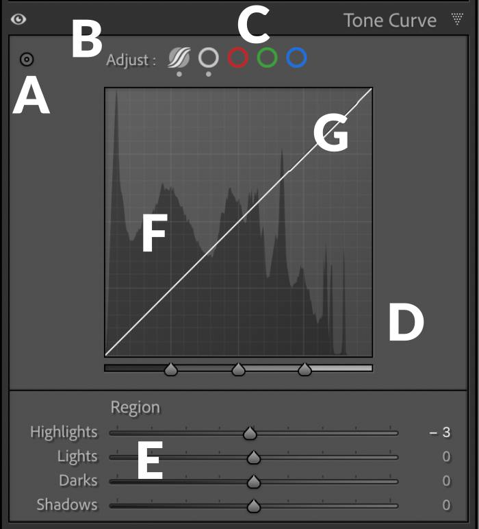
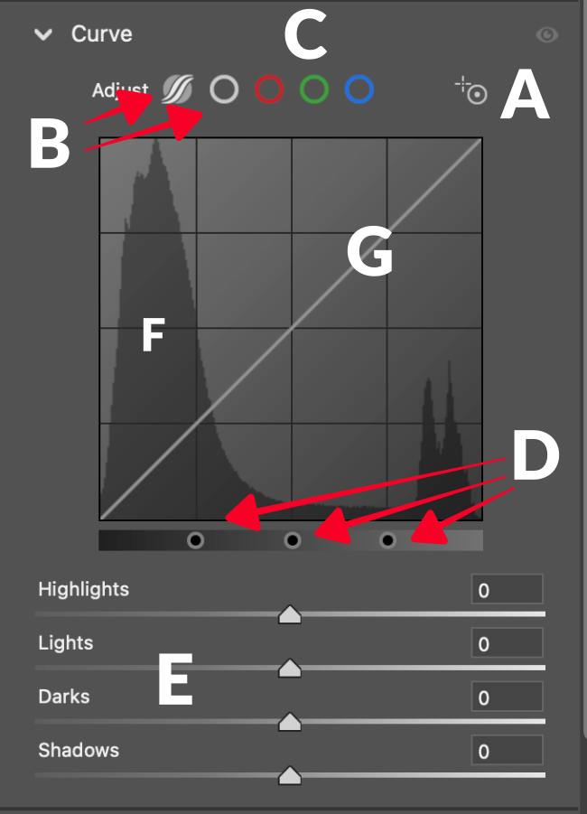
Curve Element Identification
Before adjusting anything, it’s worth knowing what you’re looking at. The Tone Curve panel packs nine distinct UI elements into a compact space — each one controls a different layer of the edit. The table below maps every element so you can locate it before the sections that follow explain how to use it.

Here are the locations on the Tone Curve Panel. There is a difference between Lightroom and Adobe Camera Raw panels. I have included images of both.
Lightroom
Adobe Camera Raw
How to Use the Tone Curve Panel
Below is a video touching on the main points of how to use the tone curve functions. I did forget to mention the shortcuts that you can use with the point tone curve that help control the movement of the control points. These are a big help, and you can click here to see the list.
The Logic of the Grid: Input vs. Output
To master the curve, you need to understand the graph. The horizontal axis represents Input — the original brightness of your pixels. The vertical axis represents Output — the new brightness you’re assigning them.
Three reference points anchor everything: 0 (bottom-left) is pure black, 255 / 100% (top-right) is pure white, and the diagonal baseline (f(x) = x) represents an unedited state. Pull a point above that line, and you’re making those tones brighter. Pull it below, and you’re darkening them.
The Bottom Line: Every adjustment you make on the Tone Curve is a brightness remapping instruction. Master this logic, and the rest of the tool becomes intuitive.
Mode 1: The Parametric Curve (Smooth and Safe)
The Parametric Curve is built for smooth, controlled tonal transitions. Instead of placing manual points, you use four region-based sliders — Highlights, Lights, Darks, and Shadows — that each govern a tonal band.
Customizing the Tonal Range
A common mistake is assuming these four regions are fixed. Beneath the graph, you’ll find three triangular Region Dividers (split points). By default, they sit at 25%, 50%, and 75%.
Moving a divider left narrows the region to its left; moving it right expands it. For example, you can shrink the Shadows region so it only affects the deepest blacks in your image without touching mid-shadow tones. This single adjustment transforms the Parametric Curve from a broad brush into a precise instrument.
The Bottom Line: The Parametric Curve’s real power isn’t in the sliders — it’s in the Region Dividers that define what those sliders actually control.
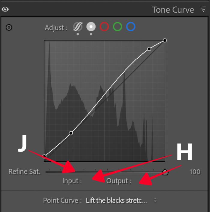
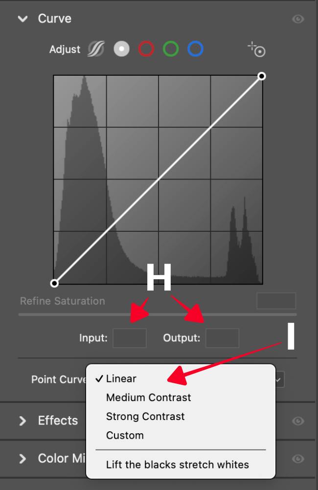
Mode 2: The Point Curve (Creative and Precise)
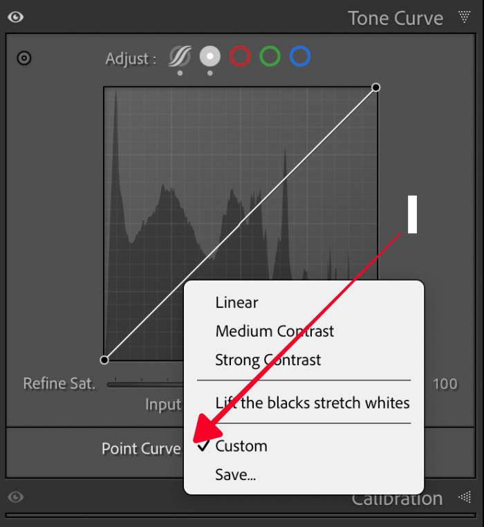
Switching to the Point Curve (the plain circle icon) removes the safety rails. This mode lets you place up to 16 manual anchor points to create complex shapes that no slider combination can replicate.
Professional Styling Recipes
The Classic S-Curve: Place three points — one each in the Shadows, Midtones, and Highlights. Pull the Highlights up and the Shadows down. This adds punch and contrast while the anchored midtone prevents a global exposure shift from creeping in.
The Matte or Faded Look: Grab the far-left anchor point (absolute black) and lift it vertically to roughly 5–10%. This remaps pure black to a shade of gray, mimicking the compressed dynamic range of vintage film. Keep it subtle — over-lifting turns the effect muddy.
Creamy Highlights: Pull the top-right anchor point (pure white) slightly downward to soften harsh specular highlights. The result is a more organic, film-like rolloff in your brightest areas.
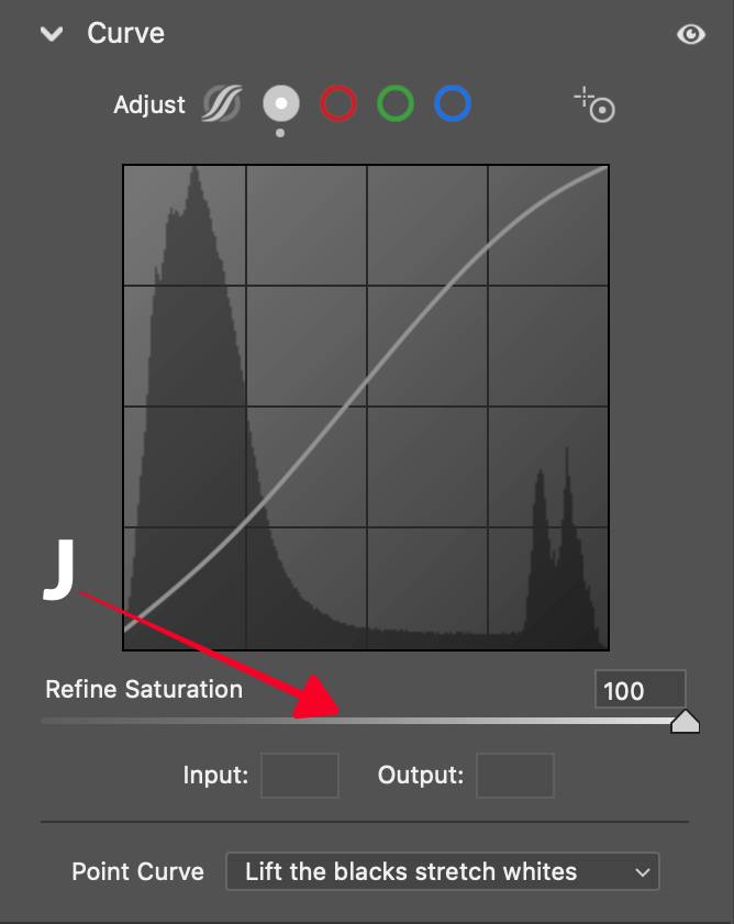
Maximizing Tonal Range: Lift the Blacks, Stretch the Whites – This is a recipe from the drop-down menu that says “Point Curve.” Lifting the blacks and stretching the whites is a reliable way to extend your tonal range. Note one trade-off: once you’ve lifted the white point on the global curve, your headroom for raising whites in local adjustments shrinks accordingly. Plan your edit order with this in mind.
The Bottom Line: The Point Curve’s 16-point capacity lets you sculpt tonal relationships that sliders can’t replicate — but each anchor point you add is a commitment to maintain as the edit evolves.
“The Refine Saturation slider turns your contrast curve into a pure Luma Curve — brightness only, colors untouched.”
The Refine Saturation Breakthrough
A fundamental problem in digital editing is that increasing contrast via curves also increases color saturation. Push an S-curve too hard, and skin tones go orange; push it further, and they go “crunchy.”
The Refine Saturation slider, introduced in Lightroom’s June 2023 update, addresses this by decoupling luminance adjustment from chromatic amplification.
Setting the value to 0 constrains the curve’s behavior to the luma channel only, applying brightness remapping without altering the underlying color values. This is functionally equivalent to operating in a Luma curve mode, where the tone mapping matrix operates independently of hue and saturation components.
The result is contrast control that preserves the original color relationships in the image data, which is particularly consequential when editing portraits or images with calibrated color targets (Adobe, 2023; Haysom, 2024).
The Bottom Line: Set Refine Saturation to 0 when you want the curve to control only brightness. Leave it at its default when you want contrast and saturation to increase together.
Power User Shortcuts for Tone Curves
Precision is everything when working with curves. Use these shortcuts to work faster and more accurately:
| Action | Shortcut (Mac/Win) | Result |
| Precision Mode | Option / Alt + Drag | Reduces mouse sensitivity by 10x for ultra-fine adjustments. |
| Vertical Lock | Shift + Drag | Constrains movement to the vertical axis only (keeps Input value constant). |
| Place Anchor | Option / Alt + Click | Places a point on the curve without moving the existing line. |
| Nudge Point | Arrow Keys | Moves a selected point up, down, left, or right by 1 unit. |
| Large Nudge | Shift + Arrow Keys | Moves a selected point by 10 units (or 2 units depending on version). |
| Reset Point | Double-Click Point | Immediately deletes a manual anchor point. |
| Reset Slider | Double-Click Name | Resets an individual Parametric slider to zero. |
| Clipping View | J (Toggle) | Turns on/off the red/blue highlight and shadow clipping warnings. |
Conclusion
The Tone Curve rewards patience. Start with the Parametric Curve to build intuition for tonal regions, then move to the Point Curve when you need shapes that sliders can’t create. Use the Refine Saturation slider any time contrast and color drift are fighting each other.
Three things to take into your next edit: set your Region Dividers before you touch the sliders, anchor your midtones before you pull your S-curve, and set Refine Saturation to 0 if skin tones are part of your shot. That’s the difference between a technically correct edit and one that actually looks good.
FAQ
Q: What’s the difference between the Parametric Curve and the Point Curve? The Parametric Curve uses four region-based sliders that create smooth transitions automatically. The Point Curve lets you place up to 16 manual anchors for precise, complex adjustments. Most photographers use Parametric for overall tonal shaping and switch to Point for stylistic effects.
Q: Will the Tone Curve affect my colors, or just brightness? By default, yes — increasing contrast via the curve also increases color saturation. Set the Refine Saturation slider to 0 in the RGB Point Curve to limit adjustments to brightness only.
Q: How many anchor points should I use on the Point Curve? As few as possible. Each extra point adds complexity and can create unintended bending in adjacent tonal regions. A three-point S-curve handles most corrections; reserve four or five points for deliberate stylistic grades.
Q: What do the triangular Region Dividers actually do? They redefine the “influence area” of each Parametric slider. Moving a divider left shrinks the region to its left; moving it right expands it. Adjusting them before you touch the sliders gives you much tighter control over which tones each slider affects.
Q: Can I use the Tone Curve on individual color channels? Yes. In the Point Curve, use the channel dropdown (RGB, Red, Green, Blue) to apply corrections to a single color channel. This is useful for targeted color grading — for example, lifting the Red channel in the Shadows to add warmth to dark areas only.
References
- Adobe. “Tone Control and Tonal Adjustment in Lightroom Classic.” Adobe Help Center. https://helpx.adobe.com/lightroom-classic/help/tone-control-adjustment.html (2023).
- Adobe. “Make Color and Tonal Adjustments in Camera Raw.” Adobe Help Center. https://helpx.adobe.com/camera-raw/using/make-color-tonal-adjustments-camera.html (2023).
- Kost, Julieanne. “The Tone Curve Panel in Lightroom Classic.” jkost.com. https://jkost.com/blog/2024/08/the-tone-curve-panel-in-lightroom-classic-2.html (2024).
- Mastering Lightroom. “Hidden Lightroom Shortcuts.” mastering-lightroom.com. https://mastering-lightroom.com/hidden-lightroom-shortcuts/ (2024).
- Signature Edits. “Lightroom Tone Curve Tutorial.” signatureedits.com. https://www.signatureedits.com/lightroom-tone-curve-tutorial/ (2024).
- PresetPro. “How to Master Tone Curves in Lightroom: The Ultimate Guide.” presetpro.com. https://www.presetpro.com/how-to-master-tone-curves-in-lightroom-the-ultimate-guide/ (2024).
- Haysom, Andrew. “Refine Saturation Slider.” andrewhaysom.myportfolio.com. https://andrewhaysom.myportfolio.com/refine-saturation-slider (2024).